Welcome to ScapeCrunch

We are ScapeCrunch, the place where planted aquarium hobbyists come to build relationships and support each other. When you're tired of doom scrolling, you've found your home here.

News New homepage for easier discovery

  • Thread starter Thread starter Art
  • Start date Start date
  • Tagged users Tagged users None

Art

Administrator
Staff member
Founding Member
Journal
Joined
Oct 29, 2022
Messages
5,425
Reaction score
4,196
Location
Florida
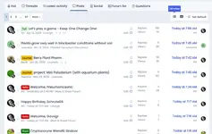
As you've seen, we have a new homepage setup. It is designed to allow you to discover more activity within the site.

Please give it a spin and hold your judgement until you've seen everything it can do. Change is always a bit jarring at the beginning.

Please post your feedback here. It's very much appreciated.
Screenshot 2025-05-21 at 4.26.34 PM.webp
 
Well, thanks, both of you. Truly. I need the input because this is all to make things better for us.

If you want the old New Posts view, just click on Posts. It remembers what you clicked and it will be the first thing you see going forward.

@Pepere LOL. The What's New is what you are seeing without having to hit the old button. The system is showing you everything that is new on the site. To have the old What's New view, just select Latest Activity and it will be what you see when you log on.

Keep the feedback coming! Thank you!!
 
I figured it out, but it certainly would be nice to have a heads up a day ahead of time of what to expect…
Agreed, but I did it intentionally.
I want to see how easily people figure it out. I have this weird hope that our site becomes as easy to use as Apple products…
 
I have this weird hope that our site becomes as easy to use as Apple products…
I am 59…. I am not fond of new and improved., I prefer old and comfortable. I sort of like things left where they are…

Every 7-8 years my local grocery store rearranges EVERYTHING. In reality it is to make people spend time looking for what they need and see things they havent thought about trying before…

They will station employees in the aisles to help irritated or confused shoppers. When they come up to me asking if they can help me, I respond “Yes. You can put everything back where it belongs!”

I really dont care where it is, just leave it alone after it is there….

People are stealing too much of my remaining life by moving things around…
 
Last edited:
Overall I'm fine with it. I'm always in favor of more filtering options in most apps. I like that it remembers which view you were using.

I miss the bold for unread things too. I really use the bold.

I also feel like the reactions being listed in the latest activity take up a lot of space. Is it possible to remove the "John reacted to <message> with Like"?

I did notice that the last entry for 'Hot' was a thread from 2023. It was a great thread, so I dont mind that it made the Hot list. 😜
 
What? You are still young, my friend!
Btw, the headings used to be bold if I hadn’t read them. Now they all look the same. Is that part of the update?
Can you snip a picture of what you mean and post it here?

I also feel like the reactions being listed in the latest activity take up a lot of space. Is it possible to remove the "John reacted to <message> with Like"?
Yes and I'll do so.
I did notice that the last entry for 'Hot' was a thread from 2023. It was a great thread, so I dont mind that it made the Hot list. 😜
It's an algorithm that takes a little time to capture what we all consider "hot" now. Should update soon.
 
‘Threads’ view has the bold bits still for me (safari on iPad), ‘latest activity’ view has no bold.

The UI on iPad safari is kinda busy (cluttered?)on top. It seems less busy on my phone (android Chrome on S24). 3 rows of choices across the top feels like it might confuse users? Dunno.

IMG_0409.webp
 
If I click on “New Posts” on the black header bar (left side panel on my phone) it goes to a page that shows “Unread” and “Read” posts. It’s what I was used to seeing. There isn’t a button to set it as the home page though.
 
Thanks for the comments, everyone!

It seems to me that this change isn't fully cooked yet and not delivering on the "easier access to more things" objective. I will revert to the old New Posts for now.

I appreciate you! ❤️
 
Thanks for the comments, everyone!

It seems to me that this change isn't fully cooked yet and not delivering on the "easier access to more things" objective. I will revert to the old New Posts for now.

I appreciate you! ❤️
Thanks for all your work to continually make this a better place!
 
Hi @Art,
Hope you are having a nice holiday weekend. Question about a recent change in the image viewer…. When I click on an image in someone’s journal, it no longer brings it up full screen (on iPad safari). It now leaves a panel on the right with info about the photo and ability to comment on it. The panel size is such that it actually made the photo get smaller than it was before I clicked on it! I think when people click on an image in a post it’s usually to take a closer look and zoom in on an area of interest. Could that be changed back to not bring up the panel, or at least make it so the user can dismiss the panel?

Here’s an image so you can make sense of my rambling.

IMG_0410.webp
 

Top 10 Trending Threads

Back
Top